
Case Study
0
0
•
UX Design Lead
•
Qualcomm / Timex
•
3 years
•
2013
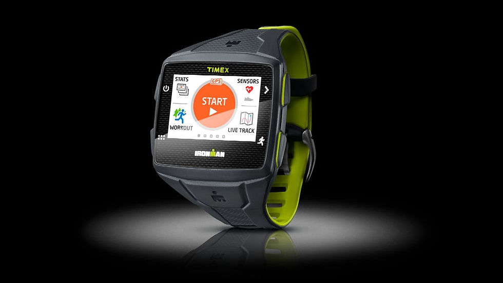
Timex Ironman ONE GPS+
Designed the full 0-to-1 product experience for a standalone GPS sports watch that allowed athletes to track workouts, receive coaching, and share data without carrying a phone. The project spanned hardware UX, embedded UI, companion app, and cloud connectivity, resulting in a design patent filed.
The Challenge
Serious athletes — triathletes, marathon runners, cyclists — wanted to train with GPS tracking and real-time coaching without carrying a phone. Existing GPS watches didn't allow connectivity in cases of emergency or automatic upload of tracked workouts . The opportunity was a standalone device that could do everything a phone-connected app could do, with an interface designed for outdoor visibility, water resistance, and split-second glances.
Originally, this concept was born as a safety product in response to a criminal case in San Diego where a teenage girl was killed while alone on a run. It was determined that having phone connectivity during her workout might have helped save her.
The Solution
We designed and developed the world's first wirelessly connected fitness watch with long battery life and durability. Timex bought the device, bringing the Ironman brand with it.
Before the Apple Watch, the Timex Ironman ONE GPS+ recorded workouts and wirelessly uploaded them. It allowed users to notify or message selected people when and where they were during workouts for safety.
"The ability to simply have your runs immediately on sites like Strava without any additional phone required is great, but the live tracking could be a ground breaker in areas where folks don’t want to drag a phone with them."
—DC Rainmaker, Triathlete Blogger and Fitness Tech Reviewer
0 → 1
Full Product UX
1 Patent
Filed
International
Product Launch
The Process
01
Discovery & Research
- Conducted contextual research with triathletes, runners, and cyclists in training environments.
- Observed how athletes interacted with existing devices during high-intensity intervals:
- Button presses missed
- Screens unreadable in sunlight
- Menus requiring multiple interactions that were impossible mid-stride.
- Identified glanceability and one-touch access as the defining UX requirements.
- Required interoperability with existing fitness accounts.
- Didn't want to be bothered during workouts by others unless for emergencies.
Context:
This product underwent 3 massive changes to its scope and requirements during the project timespan, each time requiring a reset of the product definition. Across each iteration, I participated in and conducted different methods of research based on the phase of product discovery.
- Iteration 1: Standalone, portrait-oriented watch with branding built from scratch.
- Iteration 2: Landscape-oriented watch using Mirasol always-on technology.
- Iteration 3: Built upon iteration 2, but with existing workout app integration and a branding partner.
Needs
Ability to workout safely without needing to carry a phone.
Must be reliable and accurate.
Must have the ability to post workout data and progress to an account.
Must be able to communicate with others in urgent cases.
Can't interfere with the workout.
Problems
Many users take their phone on a workout because of necessity, but would prefer an easier way to view progress during a workout. Often, the phone is attached by a pouch on the arm or in their pocket. The phone is cumbersome.
Bringing a phone on a workout means receiving distractions from non-urgent calls or messages. Users want an escape from distraction during a workout.
Users who tell others of when/where they will be working out can't always tell the person in cases when they're alone.
Findings
Iteration 1
Accurate distance and route tracking is required.
Most target users listen to music during distance workouts.
A wearable workout device must have long enough battery life for long distance workouts, and must be able to connect to a heart rate monitor.
Most female users would tell someone (partner, roommate, etc.) when/where they would workout; not a common habit for men.
When presented with the idea of being able to dial emergency services from the device, most people were uncomfortable with a button on the device that did this, worried about accidentally dialing. Generally, people only dial emergency services once in their life on average, and it's typically for someone else.
Users don't want to be bothered by phone calls or messages during a working unless it's urgent. Primary reason for not taking a phone with them on a workout. They'd bring a phone for music and workout tracking.
Some users went for a workout in the evening or night after work, and would need the ability to view metrics in low light conditions.
Iteration 3
Most regular runners and cyclists used an app for tracking performance or routes; had existing accounts with popular apps. Users expressed desire to get credit for workouts and track progress.
Reliable data gathering and transfer to existing accounts required.
02
Definition
Defined three design principles for the product:
- Glanceable (all critical info in under 1 second)
- Operable (any key action achievable with one wet thumb)
- Trustworthy (the device had to feel reliable enough that athletes would leave their phone behind).
Opportunity
Iteration 1
Ability to disrupt the workout wearables market with world's first wirelessly connected workout watch, introducing a new brand to inspire a new product category. This would allow staying wirelessly connected during a workout (for safety concerns) without being bothered by distractions.
Iteration 2:
Ability to showcase new Qualcomm screen technology with far superior battery life, easily visible in sunlight without requiring screen lighting. Users want to easily see metrics, and this would make it easier to view the screen in sunlight, a difficult feat for phone screens.
Iteration 3:
Ability to integrate with user's' existing workout app accounts and leverage a strong brand in the fitness world. This would make it easier for users to continue their workout routines without disruption to their progress.
Personas
Runners (primary user): Care about getting credit for time/distance travelled, recording accurate workout data, seeing personal metrics and heart rate, listening to music, and avoiding distraction. They want to enjoy their time to themselves and view their progress.
Cyclists (secondary user): Care about getting credit for time/distance travelled, recording accurate workout data, and avoiding distraction.
Walkers (tertiary user): Want to track routes and feel safe while walking outdoors.
Pain Points
Carrying a phone during a workout doesn't allow the user to see the stats easily.
Sometimes they receive a non-urgent call or message during the workout, breaking their focus.
When their technology fails (battery drain, failure to upload), they lose credit/progress.
03
Design & Prototyping
- Designed the physical interaction model — button mapping, gesture navigation, screen layout — optimized for exertion.
- Designed the on-device display system for workout metrics, navigation cues, and alert states readable in direct sunlight.
- Designed the interaction model for the companion mobile app for managing allowed contacts, fitness app integration, and live tracking notificaiton for safety.
- Novel interaction for one-finger keybaord pattern filed as a patent.
Ideation
System Workflows
Global UI navigation, defining required hardware buttons.
All feature interactions and navigation.
Device
Iteration 1:
Managed visual design and testing with 3rd-party design firm, building a brand from scratch.
Iterated on hardware interactions for portrait-oriented device, repurposing emergency call button.
Designed feature interaction model, integrating ANT+ technology management.
Iteration 2:
Redesigned entire UI for landscape orientation and new backlighting interaction.
Designed workflow for users off device (setup, custom app integration).
Iteration 3:
Invented one-finger flow keyboard (patent submission) to allow text entry and custom messaging.
Designed customizable stats display for workouts.
Integrated 3rd-party workout app accounts (Strava, MapMyFitness, etc.) into the workflow.
Integrated phone app setup for white-listing contacts, auto notifying them when a workout began.
Prototyping
Led the design effort for iteration 1 of the product, managing a small design team to assist in usability testing.
Led a testing team for the fitness app on the final device, triaging hardware and software bugs on the device.
Iteration 1:
Mocked up life-size screen samples to test touch target sizing based on 10mm target goals.
Tested new branding concepts with employees and potential users.
Tested a software prototype of the screens (on a computer) with users to test usability of UI navigation scheme and feature interaction details.
Integrated fedback into final design of iteration 1 UI.
Iteration 3:
Mocked up life-size screen samples to test touch target sizing based on 10mm target goals.
Tested early implementation of my keyboard design with all team members to test speed. Updated interaction model to allow swiping to characters in addition to tapping.
Became a runner to test accuracy and touchscreen interactions during workouts.
Evaluated usability feedback from all testers (including professional publication reviewers), updating feature interactions as needed.
04
Delivery
- Delivered the complete UX system across hardware, embedded UI, companion app, and cloud sync over a 3-year iterative development cycle.
- The product launched as the Timex Ironman ONE GPS+ and launched nationally.
Result
We sold the device to Timex, handing over all materials to them to continue the project going forward. The branded it as the Timex Ironman ONE GPS+.
Met with the UX Lead Designer at Timex to review the entire UI, navigation models, design rationales, user research data, and design style guides.
Built a detailed UI specification (over 650 pages) with all screen states, use cases, error conditions, and text translations, delivering it as a reference guide going forward.
Lessons learned
A purpose-built product can be successful...if people know it exists.
Sometimes it benefits a product to have the branding of an established company in the target market, such as the Timex Ironman brand in the fitness world. However, it's possible that when a product technology category is too new, an established company built on traditional methods of marketing and selling products may not be positioned to continue supporting such a product on their own, as noble as their intentions might be.
Initial reviews of the product on Amazon revealed customers were pleased with the product and reported that it met their needs.
The product had two main pain points:
The device was a bit large for smaller wrists.
The device was expensive, which was on par with the higher end GPS watches like Garmin, but a tough barrier for entry with causual athletes.
Selected Screens & Artifacts

Hardware UX-defined mappings.

Single-finger flow keyboard design — patent filed.

Device post-workout upload to 3rd-party fitness site.
Tools Used
Daniel Rivas · UX Strategy & Product Design
← Back to home
The Challenge
Serious athletes — triathletes, marathon runners, cyclists — wanted to train with GPS tracking and real-time coaching without carrying a phone. Existing GPS watches didn't allow connectivity in cases of emergency or automatic upload of tracked workouts . The opportunity was a standalone device that could do everything a phone-connected app could do, with an interface designed for outdoor visibility, water resistance, and split-second glances.
Originally, this concept was born as a safety product in response to a criminal case in San Diego where a teenage girl was killed while alone on a run. It was determined that having phone connectivity during her workout might have helped save her.
The Solution
We designed and developed the world's first wirelessly connected fitness watch with long battery life and durability. Timex bought the device, bringing the Ironman brand with it.
Before the Apple Watch, the Timex Ironman ONE GPS+ recorded workouts and wirelessly uploaded them. It allowed users to notify or message selected people when and where they were during workouts for safety.
"The ability to simply have your runs immediately on sites like Strava without any additional phone required is great, but the live tracking could be a ground breaker in areas where folks don’t want to drag a phone with them."
—DC Rainmaker, Triathlete Blogger and Fitness Tech Reviewer
Outcomes
0 → 1
Full Product UX
1 Patent
Filed
International
Product Launch
The process
1
Discovery & Research - Summary
Conducted contextual research with triathletes, runners, and cyclists in training environments.
Observed how athletes interacted with existing devices during high-intensity intervals:
Button presses missed
Screens unreadable in sunlight
Menus requiring multiple interactions that were impossible mid-stride.
Identified glanceability and one-touch access as the defining UX requirements.
Required interoperability with existing fitness accounts.
Didn't want to be bothered during workouts by others unless for emergencies.
Context
This product underwent 3 massive changes to its scope and requirements during the project timespan, each time requiring a reset of the product definition. Across each iteration, I participated in and conducted different methods of research based on the phase of product discovery.
Iteration 1: Standalone, portrait-oriented watch with branding built from scratch.
Iteration 2: Landscape-oriented watch using Mirasol always-on technology.
Iteration 3: Built upon iteration 2, but with existing workout app integration and a branding partner.
Users
Iteration 1
I interviewed runners in groups of 3 (triads) to better understand user habits and needs.
I participated in running a focus group study to evaluate several hardware prototypes with runners.
Iteration 3
I interviewed more users, including runners and cyclists, reqarding current behaviors with workout tracking technology.
I became a runner to better understand the perspective of our target user, practicing 2x/week.
Needs
Ability to workout safely without needing to carry a phone.
Must be reliable and accurate.
Must have the ability to post workout data and progress to an account.
Must be able to communicate with others in urgent cases.
Can't interfere with the workout.
Problems
Many users take their phone on a workout because of necessity, but would prefer an easier way to view progress during a workout. Often, the phone is attached by a pouch on the arm or in their pocket. The phone is cumbersome.
Bringing a phone on a workout means receiving distractions from non-urgent calls or messages. Users want an escape from distraction during a workout.
Users who tell others of when/where they will be working out can't always tell the person in cases when they're alone.
Findings
Iteration 1
Accurate distance and route tracking is required.
Most target users listen to music during distance workouts.
A wearable workout device must have long enough battery life for long distance workouts, and must be able to connect to a heart rate monitor.
Most female users would tell someone (partner, roommate, etc.) when/where they would workout; not a common habit for men.
When presented with the idea of being able to dial emergency services from the device, most people were uncomfortable with a button on the device that did this, worried about accidentally dialing. Generally, people only dial emergency services once in their life on average, and it's typically for someone else.
Users don't want to be bothered by phone calls or messages during a working unless it's urgent. Primary reason for not taking a phone with them on a workout. They'd bring a phone for music and workout tracking.
Some users went for a workout in the evening or night after work, and would need the ability to view metrics in low light conditions.
Iteration 3
Most regular runners and cyclists used an app for tracking performance or routes; had existing accounts with popular apps. Users expressed desire to get credit for workouts and track progress.
Reliable data gathering and transfer to existing accounts required.


2
Definition - Summary
Defined three design principles for the product:
glanceable (all critical info in under 1 second)
operable (any key action achievable with one wet thumb)
trustworthy (the device had to feel reliable enough that athletes would leave their phone behind).
Opportunity
Iteration 1
Ability to disrupt the workout wearables market with world's first wirelessly connected workout watch, introducing a new brand to inspire a new product category. This would allow staying wirelessly connected during a workout (for safety concerns) without being bothered by distractions.
Iteration 2:
Ability to showcase new Qualcomm screen technology with far superior battery life, easily visible in sunlight without requiring screen lighting. Users want to easily see metrics, and this would make it easier to view the screen in sunlight, a difficult feat for phone screens.
Iteration 3:
Ability to integrate with user's' existing workout app accounts and leverage a strong brand in the fitness world. This would make it easier for users to continue their workout routines without disruption to their progress.
Personas
Runners (primary user): Care about getting credit for time/distance travelled, recording accurate workout data, seeing personal metrics and heart rate, listening to music, and avoiding distraction. They want to enjoy their time to themselves and view their progress.
Cyclists (secondary user): Care about getting credit for time/distance travelled, recording accurate workout data, and avoiding distraction.
Walkers (tertiary user): Want to track routes and feel safe while walking outdoors.
Pain Points
Carrying a phone during a workout doesn't allow the user to see the stats easily.
Sometimes they receive a non-urgent call or message during the workout, breaking their focus.
When their technology fails (battery drain, failure to upload), they lose credit/progress.

3
Design & Prototyping - Summary
Designed the physical interaction model — button mapping, gesture navigation, screen layout — optimized for exertion.
Designed the on-device display system for workout metrics, navigation cues, and alert states readable in direct sunlight.
Designed the interaction model for the companion mobile app for managing allowed contacts, fitness app integration, and live tracking notificaiton for safety.
Novel interaction for one-finger keybaord pattern filed as a patent.
Ideation
System Workflows
Global UI navigation, defining required hardware buttons.
All feature interactions and navigation.
Device
Iteration 1:
Managed visual design and testing with 3rd-party design firm, building a brand from scratch.
Iterated on hardware interactions for portrait-oriented device, repurposing emergency call button.
Designed feature interaction model, integrating ANT+ technology management.
Iteration 2:
Redesigned entire UI for landscape orientation and new backlighting interaction.
Designed workflow for users off device (setup, custom app integration).
Iteration 3:
Invented one-finger flow keyboard (patent submission) to allow text entry and custom messaging.
Designed customizable stats display for workouts.
Integrated 3rd-party workout app accounts (Strava, MapMyFitness, etc.) into the workflow.
Integrated phone app setup for white-listing contacts, auto notifying them when a workout began.
Prototyping & Testing
Led the design effort for iteration 1 of the product, managing a small design team to assist in usability testing.
Led a testing team for the fitness app on the final device, triaging hardware and software bugs on the device.
Iteration 1:
Mocked up life-size screen samples to test touch target sizing based on 10mm target goals.
Tested new branding concepts with employees and potential users.
Tested a software prototype of the screens (on a computer) with users to test usability of UI navigation scheme and feature interaction details.
Integrated fedback into final design of iteration 1 UI.
Iteration 3:
Mocked up life-size screen samples to test touch target sizing based on 10mm target goals.
Tested early implementation of my keyboard design with all team members to test speed. Updated interaction model to allow swiping to characters in addition to tapping.
Became a runner to test accuracy and touchscreen interactions during workouts.
Evaluated usability feedback from all testers (including professional publication reviewers), updating feature interactions as needed.
4
Delivery - Summary
Delivered the complete UX system across hardware, embedded UI, companion app, and cloud sync over a 3-year iterative development cycle.
The product launched as the Timex Ironman ONE GPS+ and launched nationally.
Result
We sold the device to Timex, handing over all materials to them to continue the project going forward. The branded it as the Timex Ironman ONE GPS+.
Met with the UX Lead Designer at Timex to review the entire UI, navigation models, design rationales, user research data, and design style guides.
Built a detailed UI specification (over 650 pages) with all screen states, use cases, error conditions, and text translations, delivering it as a reference guide going forward.
Lessons Learned
A purpose-built product can be successful...if people know it exists.
Sometimes it benefits a product to have the branding of an established company in the target market, such as the Timex Ironman brand in the fitness world. However, it's possible that when a product technology category is too new, an established company built on traditional methods of marketing and selling products may not be positioned to continue supporting such a product on their own, as noble as their intentions might be.
Initial reviews of the product on Amazon revealed customers were pleased with the product and reported that it met their needs.
The product had two main pain points:
The device was a bit large for smaller wrists.
The device was expensive, which was on par with the higher end GPS watches like Garmin, but a tough barrier for entry with causual athletes.
